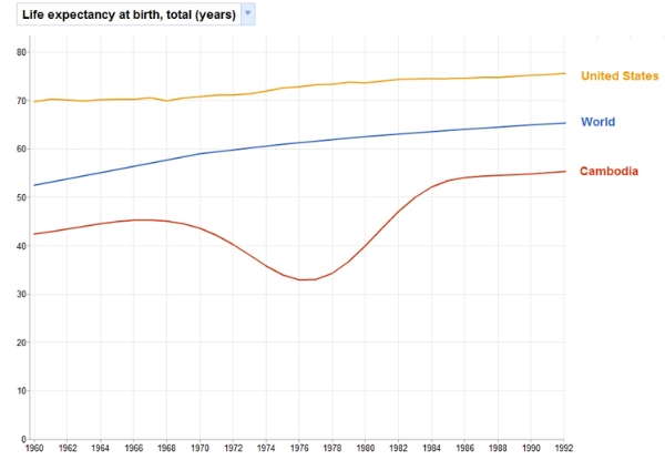
Yes, World Bank data is sketchy and charts can be deceiving. Even so, you can do some powerful things with Google's Public Data Explorer. The graphic below charts life expectancy against GDP per capita. Try dragging the year cursor from left to right, or press play. Note the downward "genocide bounce" experienced first by Cambodia and then by Rwanda. Note, too, the sprint for global inequality that has occurred in the past ten years, too -- Luxembourg and Bermuda lead the way.

